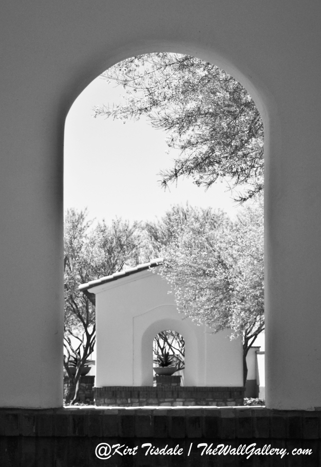
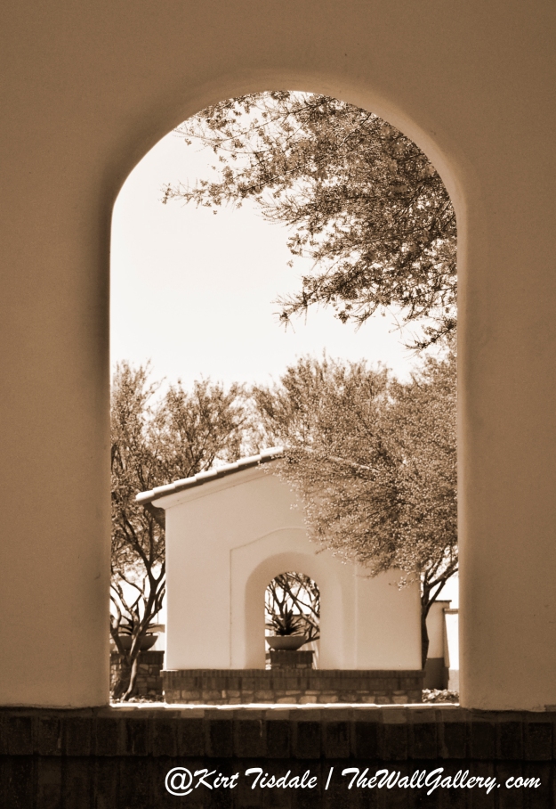
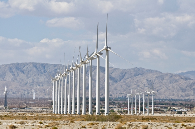
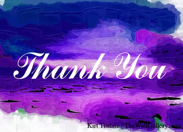
On my website, one of my galleries is called Note Cards. I have my art on the front of a variety of thank you cards and all occasion cards (the cards are folded with a blank inside for personalizing your thoughts). I just added a number of new prints and am featuring four of them here.
The first one is from my Black and White Gallery. I took this sunset shot about three years ago along the coast of North San Diego County. You usually see sunset shots in full color, but I did a series for a business in San Diego and their decor required all black and white photography. They loved this particular series and I have to admit when it was done, I was surprised at how well it worked (there are four shots in this series). I have sold a number of them and thought this particular one would make a great Thank You card. It has a more professional and business feel.
So we go from black and white to purple abstract. This particular print is from my Abstract Oil Gallery. Again, I thought this would make a great thank you card without being over the top and works well for a variety of people (as a former corporate regional manager, I use to send thank you cards with a personal note to my top performing employees each month. I always struggled to find cards that were warm, yet professional).
This print was actually taken from the deck of our house overlooking the Pacific Ocean and no that’s not a smudge above the “a” and “n” in the sky above “Thank”, but a flight going between San Diego and Los Angeles….just off the coast is the airplane highway between the two areas.
And the last one I’m featuring is a watercolor of a garden lamp surrounded by vines. This is a print I did of one of the courtyard lamps found in the Alamo located in San Antonio, Texas. I was shooting a series of pictures of the architecture of the Alamo and around the Alamo (River Walk) when I saw this hanging near a bench my wife was sitting on patiently waiting for me to finish.
The last comment I wanted to make was about the words “Thank You” in reference to the font to be used and location of the words. On a finished product one should not give that any thought. If a person doesn’t give it any thought then I’ve done a good job, but I must say it’s fun to watch how many fonts and sizes and locations are tried before settling on the final product.
I invite you to come into the gallery to view the new additions to the collection in the Note Card Gallery.
Please visit my main gallery: TheWallGallery (All domestic orders over $60.00 – free shipping!)
Follow my work:
Facebook: TheWallGallery by Kirt Tisdale. (Page likes are always appreciated!)
Google+: TheWallGallery
Twitter: KirtWallGallery


