Tag Archives: abstract art prints

Still Life Fruit

For todays post, I wanted to share the process I went through in creating some “fruit” still life art prints. The art prints started with photographic captures I took of decorative fruit. The fruit pieces in question were decorative elements we had on our dining room table.

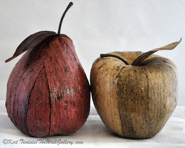
I took a picture of a decorative pear and apple side by side –

Pear and Apple Blog

From there I created an art print using a basic watercolor technique –

Pear and Apple

Then I decided to really get creative and did this abstract watercolor print based on the same subjects.

Pear and Apple Watercolor

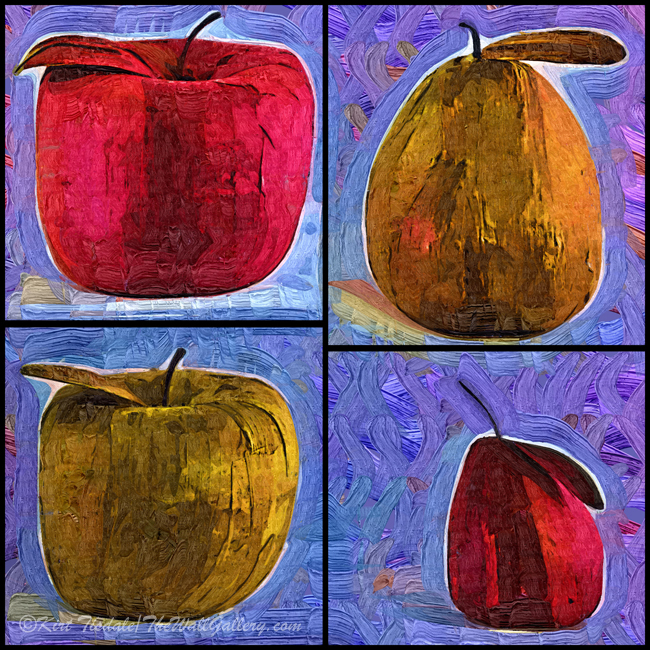
The next series of photographs I took were individual captures of two pears of different colors and two apples of different colors. I then cropped the four different fruits into a square with the brown and red fruits diagonally across from each other.

Pear Apple Squared Blog

I then created an art print using the same abstract watercolor technique.

Four Corners of Apples and Pears

And then created an art print of the same subject using a fauvism style.

Four Square Fruit

Thoughts? As I have said before, everyone reacts to visual art techniques and looks differently, so I am not in the least offended by opinions. 

Follow my work:

My art gallery: TheWallGallery

Facebook: TheWallGallery.KirtTisdale

Instagram: instagram.com/kirttisdale/

Twitter: KirtWallGallery

Abstract Ocean Sunsets And Full Moon Set

I’ve been sharing this year some of the photographs that have been the inspiration or original version of my art prints. This week I’m sharing my abstract art interpretation of two coastal sunsets and one coastal moon set. All three are along the Pacific Ocean coastline…one in San Diego County and two in Northern California.

The first one is based on an actual photograph of a sunset I captured from the bedroom deck of our house. Our neighborhood was built on a ridge of hills that was located next to the Carlsbad Water District retention pond (Carlsbad is a coastal community in Northern San Diego County). I mention that because the bulk of the land to support that retention pond was a wide open field that will never be developed. It afforded all of the homes along the western front of the neighborhood great ocean views. The house we raised our girls in was at the end of a cul-de-sac that was on that western edge of the development affording us a view of the coastline and the Pacific Ocean.

Carlsbad, California Ocean Sunset

Using this photograph I did a digital re-creation of the scene for my Abstract Art Gallery.

Orange Ocean Sunset

The next two art prints were created from memory, again using abstract art as the focus of the creation. The two depictions came from memory of coastal scenes in Northern California that really stuck with me. The first one is a sunset with a typical evening marine layer of clouds coming in just before the sun actually set. The low clouds would part sporadically and allow the setting sun to shine through.

Blue Abstract Sunset

The next one was a full moon setting as a marine layer started rolling in. The low clouds would part sporadically and allow the setting moon to shine through very similar to the setting sun creation above.

Abstract Coastal Moon Setting

Thoughts? As I have said before, everyone reacts to visual art techniques and looks differently, so I am not in the least offended by opinions. 

Follow my work:

My art gallery: TheWallGallery

Facebook: TheWallGallery.KirtTisdale

Instagram: instagram.com/kirttisdale/

Twitter: KirtWallGallery

Purple Butterflies – Art Print of the Week

Purple Butterflies

This particular art print I’m featuring this week is one of six creations featuring butterflies. All six of those are actually the same print, but done in a variety of colors. I thought it might be interesting to go through the creation of this particular print.

I’ll start with the original photographic capture and walk through the steps I took to end up with the final art print.

Initial Purple Butterfly

This was a rather large silken butterfly decoration hanging from a garden walkway at a pre-school in the Los Angeles area. It caught my eye and I snapped a couple of shots to see what I could do with it (the creative element is always at work in my head).

Then from this capture, I took it to Photoshop where I create my art and digitally “cut” the butterfly out of the picture. I drew the outline to create obvious edges and then started playing with paint styles and techniques. From that process it resulted in the this capture.

The Individual Purple Butterfly Created

Then I created a few different sizes and rotated the images to create different flying angles. For the background I went through a similar process with a single leaf. I made a dupIicate of that leaf and chose two different colors to use. I also made them transparent so that the background would bleed through. I then duplicated them into various sizes and worked at positioning each leaf to created the entire scene. Last step was to create a soft color for the background. For anyone that has worked with Photoshop you know that each step is on a different layer and as you are creating you have a multitude of layers. When I was done, I merged the layers into the final print you see above.

Thoughts? As I have said before, everyone reacts to visual art techniques and looks differently, so I am not in the least offended by opinions. 

Follow my work:

My art gallery: TheWallGallery

Facebook: TheWallGallery.KirtTisdale

Instagram: instagram.com/kirttisdale/

Twitter: KirtWallGallery

Tropical Homes

This week I’m sharing three prints that I created using strong linear sketches with a soft sprayed watercolor technique. The subject matter is three homes that caught my eye on the big island of Hawaii. The straight lines of the architecture on each of the homes creates a very clean modern look. I wanted to take that look and create an almost abstract print with this type of technique. I also chose to keep the color range in earth tones so as to not distract from the overall simplistic approach.

Large Modern Home
Hawaiian Home
Tropical Modern Home

Thoughts? As I have said before, everyone reacts to visual art techniques and looks differently, so I am not in the least offended by opinions. 

Follow my work:

My art gallery: TheWallGallery

Facebook: TheWallGallery.KirtTisdale

Instagram: instagram.com/kirttisdale/

Twitter: KirtWallGallery

Abstract Macro Blooms

You might recognize these macro captures of dahlia blooms from the original photographic shots I shared in early August. I used those shots and played with a variety of different digital techniques to give them a more abstract painted look. It is a subtle difference, but if you look closely you will see the simplified “brush strokes” in patterns following the contours of each petal.

Bright Yellow Abstract Bloom
Bright Red Abstract Bloom
Bright Pink And Yellow Abstract Bloom
Soft Pink And Yellow Abstract Bloom

Thoughts? As I have said before, everyone reacts to visual art techniques and looks differently, so I am not in the least offended by opinions. 

Follow my work:

My art gallery: TheWallGallery

Facebook: TheWallGallery.KirtTisdale

Instagram: instagram.com/kirttisdale/

Twitter: KirtWallGallery

Instagram: instagram.com/kirttisdale/

Twitter: KirtWallGallery

An Abstract Spectrum of Art

I chose to go into a completely different direction this week by sharing four abstract art prints I have created. I go from bold shapes and colors to softer looks using natural inspirations.

I’m starting with a free form abstract look that I created by playing with shapes and color. Using a fauvism style for the painting presentation (which creates depth), I literally just played with one color and shape at a time, building them together and some on top of each other.

Purple Pattern

The next one was inspired by a large red tube art piece near the Space Needle in Seattle. I recreated the suggestion of the tube shape with the primary color being red. Again, I used a fauvism style of painting to add more depth to the look.

The Red Tubes

From these bold bright pieces, the next one is more subtle in presentation and colors. The subject is a leafless tree along a river front during the winter months. I recreated the original capture using a mix of soft colors and used an impasto style on these brush strokes to add some depth.

Barren Trees

From these prints, I take us all the way over to a soft and subtle presentation. The setting becomes apparent, but is still in an abstract style.

Beach in Blue

Thoughts? As I have said before, everyone reacts to visual art techniques and looks differently, so I am not in the least offended by opinions. 

Follow my work:

My art gallery: TheWallGallery

Facebook: TheWallGallery.KirtTisdale

Instagram: instagram.com/kirttisdale/

Twitter: KirtWallGallery

Fauvism

I have done a number of my digital art prints using a fauvism technique and I thought I would share what that means. The “fauvism” technique was introduced in 1905 by a group of artist. It used bold colors, strongly textured brush strokes and non-naturalistic depictions. I like the style as it created more freedom in depiction of subjects versus just straight forward presentations. In my opinion it works well with certain subjects and not so well with others. Unfortunately that still comes back to the eye of the beholder versus any hard set rule, but actually that’s the case with almost all art. Having said that I am sharing three prints that were created using a fauvism digital art program.

Orange Bud In Fauvism

This is a good example of shape, color and texture in that the bud is painted in a slight surreal shape and the colors and brush strokes are very strong.

Fauvist Vase and Pitcher

This particular print highlights the brush strokes and bold colors with just a slight abstract shape element.

Orange Flame Rose

Again, slight shape element, but very bold brush strokes with surreal background colors.

Thoughts? As I have said before, everyone reacts to visual art techniques and looks differently, so I am not in the least offended by opinions. 

Follow my work:

My art gallery: TheWallGallery

Facebook: TheWallGallery.KirtTisdale

Instagram: instagram.com/kirttisdale/

Twitter: KirtWallGallery

Hot Air Balloons in Abstract Style

I not only love flying in hot air balloons, I love the look of them. I’ve done a number of posts over the years on them and today’s post is of a couple different abstract techniques I used depicting them.

The first one was created using a fauvism (Fauvism: a style of painting with vivid expressionistic and non-naturalistic use of color that flourished in Paris from 1905) technique. This technique uses abstract shapes and variations of colors to create a unique look. The event is the annual Hot Air Balloon Festival in Avondale, Arizona (Phoenix metropolitan area). The balloon envelopes are inflated in the early morning hours for flights and races. After that series of events, the balloons are deflated until the evening hours when the envelopes are again inflated, but this time they stay on the ground. As evening turns into night with the darkening sky, the balloon operators shoot large flames up into the envelope of the balloon illuminating the brightly colored balloons.

Hot Air Balloons Night Festival In Abstract

Using a minimalist watercolor and drawing technique of the same evening event is the next one.

Night Glow Hot Air Balloons In Abstract

Then using that same technique depicting a single hot air balloon preparing for a day time flight.

Fully Inflated

Thoughts? As I have said before, everyone reacts to visual art techniques and looks differently, so I am not in the least offended by opinions. 

Follow my work:

My art gallery: TheWallGallery

Facebook: TheWallGallery.KirtTisdale

Instagram: instagram.com/kirttisdale/

Twitter: KirtWallGallery

Happy New Year 2024

Hello 2024!!! May your year be filled with all of the above!!

Follow my work:

My art gallery: TheWallGallery

Facebook: TheWallGallery.KirtTisdale

Instagram: instagram.com/kirttisdale/

Twitter: KirtWallGallery

Ready For Boarding and Up In The Air We Go

In this weeks blog I’m featuring two Hot Air Balloon art prints that I haven’t shared before. I have shared a number of my prints in prior blogs and they all go back to two locations: Coastal San Diego or Avondale, Arizona (Phoenix metropolitan area). I go back to the photo shoots from both areas and always think of different techniques I could try for creating new art. The one consistency between both is that I typically capture hot air balloons in the many stages of inflation as it creates unique art pieces. That’s not to say I haven’t also captured your typical “sailing in the air” moments. Today I’m sharing two pieces that show both inflated ready to fly and half inflated balloons being prepped for flight. I created both using an abstract drawing and watercolor technique that creates the general forms and look, without the specific detail. The colors and patterns on the balloons speak for themselves making each one a unique art piece.

The first one is “Ready For Boarding” which focuses on an inflated balloon ready to be boarded for flight. The perspective is a close cropped aspect of the gondola tied into the balloon that is “Ready for Boarding”.

Ready for Boarding

The next print is another balloon ready for flight, but in this perspective I depicted the entire balloon with a back ground of other balloons being inflated.

Up Into The Air We Go

Thoughts? As I have said before, everyone reacts to visual art techniques and looks differently, so I am not in the least offended by opinions. 

Follow my work:

My art gallery: TheWallGallery

Facebook: TheWallGallery.KirtTisdale

Instagram: instagram.com/kirttisdale/

Twitter: KirtWallGallery