Monthly Archives: August 2013

Abstract Watercolor

Since abstract art prints are not just limited to oil paintings, I wanted to share a couple of new prints I just added to my Abstract Watercolor Gallery. The first one is title “Red Sunset”.  The painting is inspired by a sunset over the Pacific Ocean from the coastal hills of North San Diego County. I really went strong on the red because that particular sunset was such a vibrant display of color.

I also wanted to share the next painting titled: “Bare Branches”.

This particular painting was inspired by bare tree branches along the Cedar River in Cedar Rapids, Iowa mid February. The angular abstract shaping of the tree branches emphasizes the bareness and the purple creates a strong back drop and introduces the thought of temperature (cold).  I invite you to look at the rest of the gallery and would love any feedback….Thanks!

Abstract Oil Painting

Most of the work I have posted here has revolved around my photography or landscape watercolors. Kind of quiet and serene. Once in a while you just have to shake it up. This week I’m talking about my abstract art gallery. I just updated my abstract oil gallery with about 15 new prints.

I have an affinity for abstract art. I am drawn to the texture, shapes and colors. In looking at my own art, I am always thinking…what decor would that look good in. I can visualize the landscape watercolors with a certain matting and frame color to bring out the best in the look. In a lot of our rooms we look for soothing earth tones. There are those rooms or walls that just need a bolder accent to complete a look. I give you that abstract art has a more selected opportunity in certain decors. That said, I am seeing more of abstract art used in traditional decors to give a wall or a room, a bold accent. The art itself does serve that purpose.

I’ve attached one of the prints I just added to the gallery. A bright splash of red with bold brush strokes. This piece would make a great focal point to a wall and a room. The red is a great accent color for almost any room and gives you the red needed in feng shui.

I am fortunate that I have family and friends that like my work and I have seen some of my abstracts matted and framed in their houses. The typical selection is white matting with modern black frames. That seems to work in a number of different types of rooms and allows the piece to stand on it’s own. A lot of abstract art also looks great on canvas. With the ability to print almost any art piece on paper or canvas it widens the possibilities depending on the look you are seeking.

I’d love to get some feedback on abstract art in general, this print or any in my gallery. Thanks!

The Rock

I have two Black and White Photography Galleries on my web site, the first one has prints based on architectural elements and the second one is… for lack of a better term….everything else. Last week my post “The Hallway” was from a series of prints I updated gallery 1 with. This week, my picture is from new photographs I have updated gallery 2 with.

I picked this particular print of coastal Oregon because of the elements of the picture and how they work for a black and white photograph.

The most obvious element is the rock itself…notice how strong the black is and the defined contrast to the surrounding beach. The beach itself serves as a great mid-tone for the darker rock and then you have the misty fog at the top of the picture creating a soft, subtle area in complete contrast to the “Rock“. If the contrast and shapes don’t create some sort of distinct contrast, the odds are good it won’t look good in a black and white photograph.

Black and white photography when framed correctly gives any decor that modern clean look. All of that said, what are your thoughts on the picture? Thanks!


The Hallway

I just updated my Black and White Photography Gallery with some new prints. The gallery theme is architecture and architectural elements. One of the new additions stood out and I wanted to share it. I call it the hallway. It’s a hallway in the Fairmont Empress in Victoria, British Columbia. I took the original shot because I had a sense that the symmetry and depth created something interesting…not until I converted it to black and white did I realize how true that statement was. I’ve talked about it before, but it’s always worth looking at…black and white photography (similar to sepia tones, but for different reasons) create a totally different picture than color. That said, the elements of a picture must be strong and possess distinct contrast for it to work in black and white. Take a look at the picture and let me know what you think.

For  additional black and white prints visit the updated gallery or my main website for all of my prints.

Inspiration

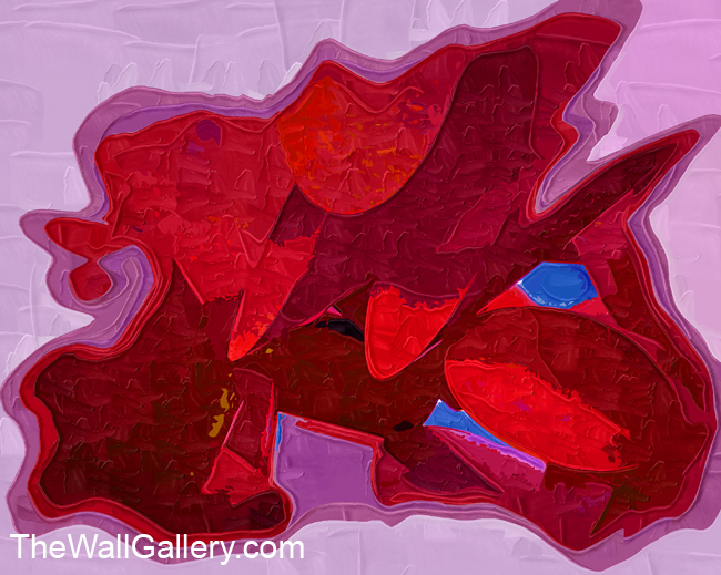
I just opened a new gallery on my web site called Inspiration.  I have been creating a few of my art prints with some of my prayers and biblical quotes. I then felt moved to actually do a gallery with inspirational quotes using my art as a back drop. I am a man of faith and am very spiritual and philosophical…that said, I use the Bible as my reference point. I like to look at different versions of the bible to get one that talks to me in as plain of english as possible. If a quote comes to mind, I start thinking of which picture that works with. Sometimes it works in reverse….I think of a picture and try to figure out what type of quote goes with it. This first picture was the watercolor inspiring me and looking for a matching quote. In this watercolor I see a very quiet relaxing inspirational space. A very “zen” space which is often sought out for refuge from the daily grind. That train of thought led me to Psalm 62:8.

A very peaceful and serene scene!

The next step is to place the quote on the picture and pick the font. Sounds easy enough, but I need to make sure to keep the balance in the picture and that the quote doesn’t get lost and is easy to read. Again, sounds simple enough, but in a few of the oil paintings I had to “doctor” the area of the quote so the type wasn’t lost in the busyness of the background.

Next is one of my favorites. I love the picture…it’s of the mountains around North Bend, Washington. This picture definitely drove the quote. I keep reminding myself on a daily basis the power of faith and this quote comes to mind all the time! As I was painting this particular picture, all I could think of was the “faith” quote. To me it was the perfect fit.

The quote from Matthew is a very powerful statement. Again, from my perspective this watercolor and the quote are a perfect match.

The next one was a prayer of mine seeking a picture. I feel really strongly about quieting the mind so we may hear the voice of the Lord. It’s a real challenge for me frankly, because the moment I stop to quiet myself….my mind goes into overdrive. I was going through my portfolio looking for a print that speaks “quiet” to me. When I came across this scene, I was struck with the complete stillness of an early morning fog.

The next example was prayer inspired. I accept the many blessings we are given and am constantly in awe of the timing of events.  I am truly a blessed man. In one of my philosophical moments with myself, I was having this mental debate about blessings past and future….totally missing the main point…the blessings of the moment…being in the moment and appreciating what you have at this point in time. I remembered this sunset watercolor and found a fit.

The last example was a picture looking for a quote. I love this watercolor. The lighting on the docks by each boat always draws my eye in to see if anyone is coming or going. I found what I was looking for in Psalm 143:8.

Thanks for letting me share as I open a new gallery. I invite you to check out the rest of the art prints in my Inspiration Gallery and as always invite you to explore my main web gallery: The Wall Gallery.