This week I had an opportunity for a photo shoot within a block of home. We live near the Sierra Estrella Mountain Range just outside of Phoenix. Whenever we get “weather”, often times there are very interesting cloud formations that appear over the range. Well, Monday morning was just such an event. Unfortunately it was a record rainfall for the Phoenix area, most in one day. Being on the side of the city we are, we had the rain first and then it moved over the rest of the metropolitan area. The rain subsided in our area while the city was still getting heavy amounts. I took that opportunity to hike up a hill nearby and point my camera at the mountain range. I have attached some shots from that shoot. What occurred to me as I was shooting; when is it best to go with a wide angel shot or zoom in?
When you are taking scenery or landscape shots, often times if you shoot too wide, you lose the effect you were looking for. Unless you are intentionally going for the panorama frame, you have to be careful how much you include. Think about any pictures you have taken of a gorgeous mountain range only to see the finished product and it doesn’t look as dynamic as it was in person. To compensate for this, you can frame just portions of the view into a shot or use a zoom lens to pull the subject closer in. The zoom lens also plays with the field of depth making the subject look closer.
The next thing to think about, what are you trying to portray? What story do you want to tell with your picture? Often times the answer will tell you whether you are going to stay wide or focus in.

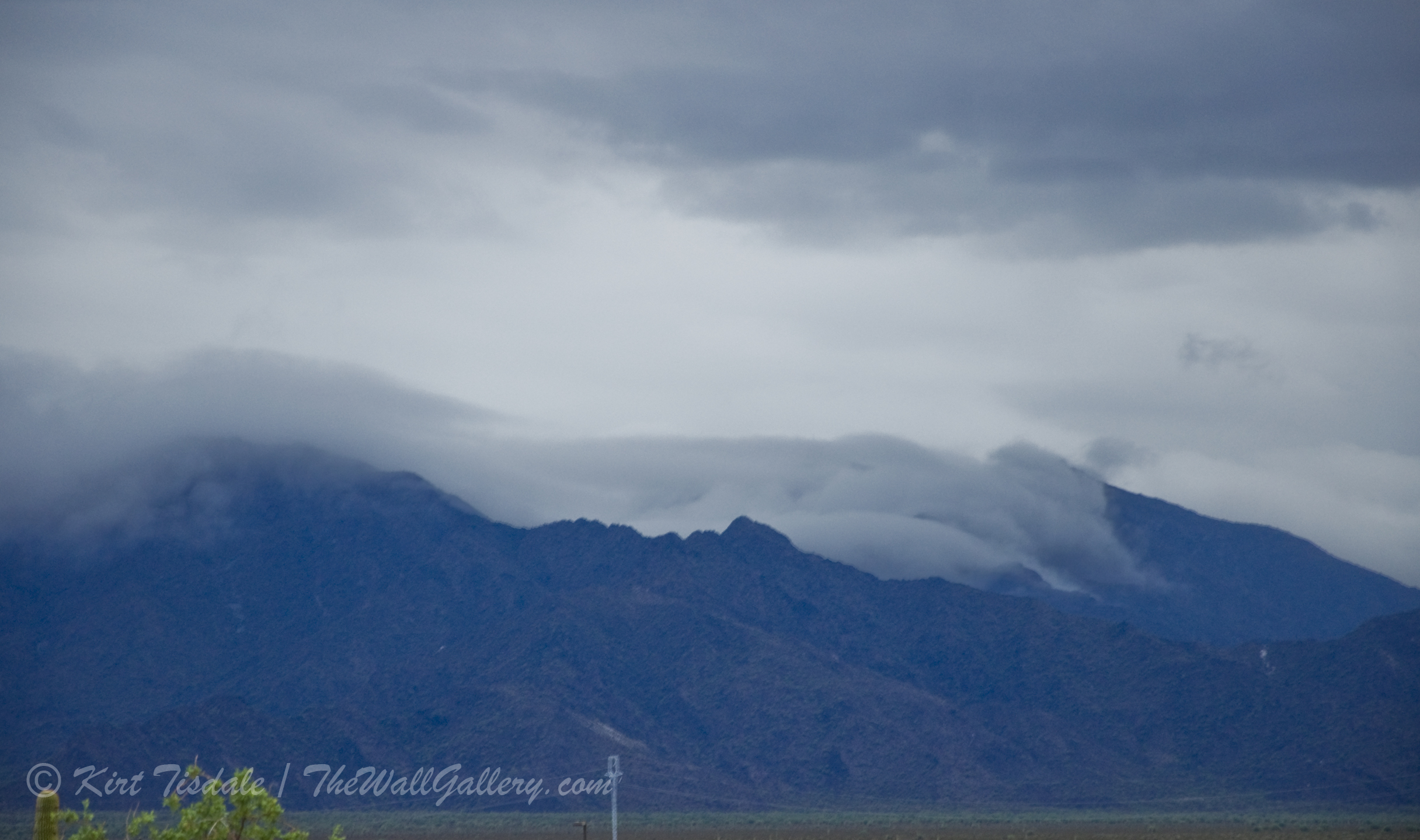
Clouds and Mountains 1
Let’s look at the attached shots. (Disclaimer: these shots are straight from my photo shoot without cropping or other cosmetic touch ups) The first one gives you a wide-angle look at a part of the mountain range. You have the houses in the foreground, but the shot encompasses enough that you see a layer of low hanging clouds enveloping the mountains. The peaks that can be seen are only the foothills; there are 4500 ft. peaks behind them covered by the clouds. The city of Phoenix is on the other side of the mountain range.

Clouds and Mountains 2
The second shot is angled just slightly to my right giving you more of the mountain range. These two shots are not pristine (houses in foreground), but do tell a story of low hanging clouds creeping over a mountain range.

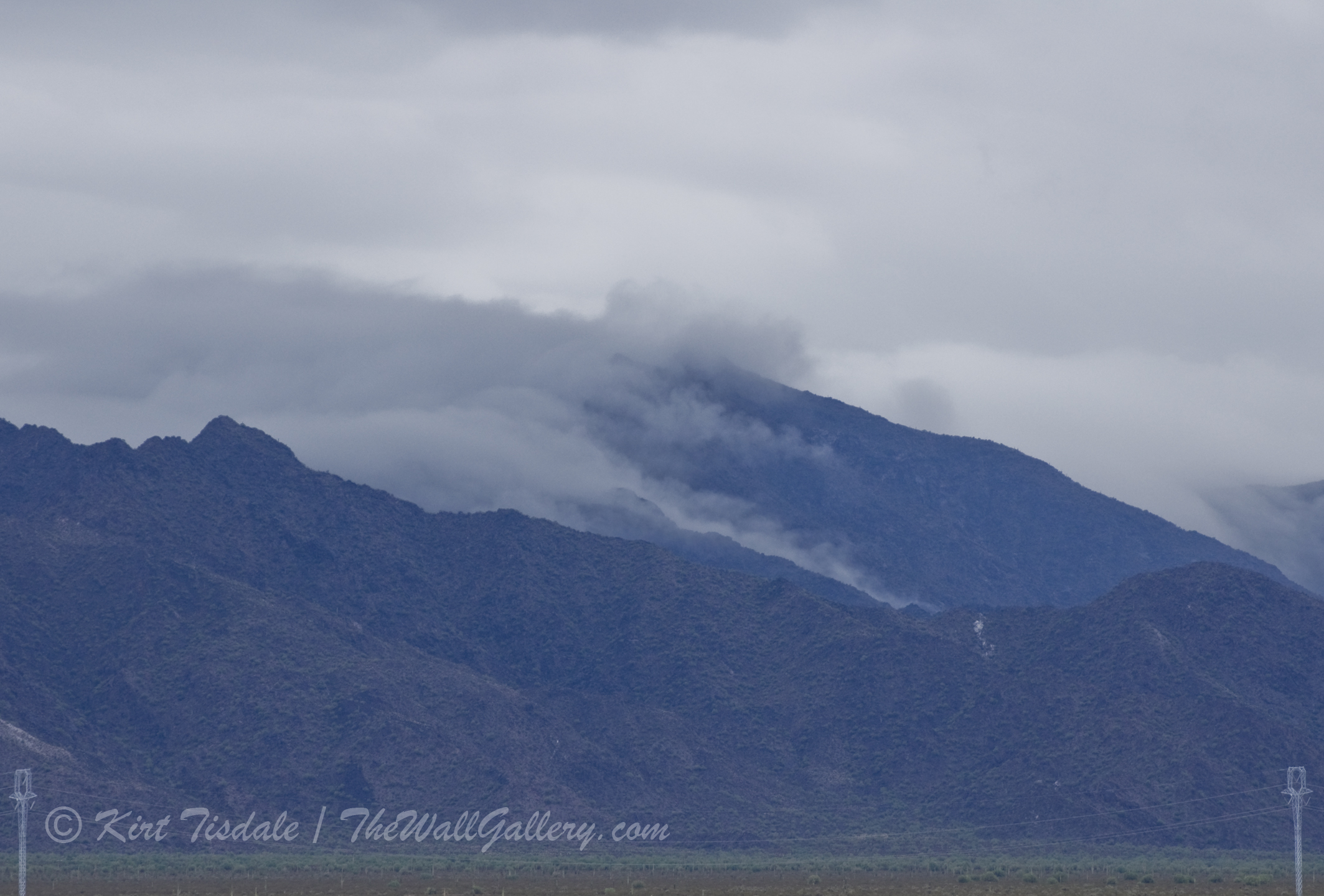
Clouds and Mountains 3
For the third shot, I haven’t moved, but zoomed in with my telephoto lens. I have framed the foreground of houses out of the picture and captured less of the mountain range, but still tell a story of storm clouds creepy over a mountain. Notice I said mountain and not mountain range, because that aspect has changed.

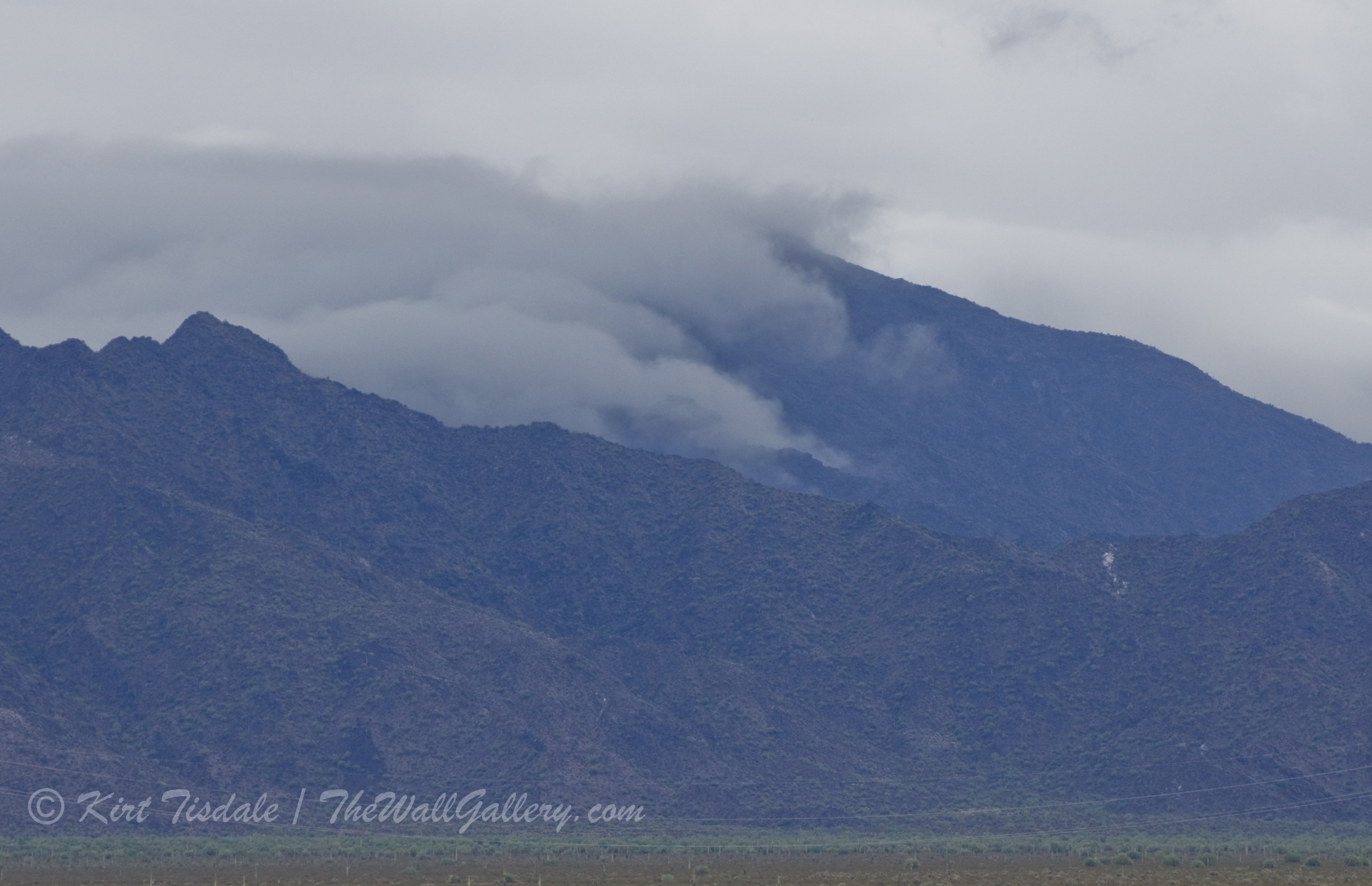
Clouds and Mountains 4
For the fourth shot, I have zoomed in more to focus on that particular patch of clouds as it hugs the side of the mountain. Notice how the story is slightly different as the perspective of the shot changes.

Clouds and Mountains 5
The fifth photograph is very close to the fourth, just tighter focus on the clouds hugging the side of the mountain.
I just wanted to give you some things to think about and some examples when shooting landscapes and scenery shots. Depending on what story you want to tell, when is it better to keep the shot wider and when to tighten in. Notice I haven’t said which is better or which is correct, because again, it depends on what story you want to tell. That said, for the purpose of this shoot, I prefer number two even with the houses in the foreground because it tells more of the story I was trying to tell. And with Photoshop, those houses can become cactus easy enough 🙂 Thoughts?
Please visit my main gallery: TheWallGallery (All domestic orders over $60.00 – free shipping!)
Follow my work:
Facebook: TheWallGallery by Kirt Tisdale. (Page likes are always appreciated!)
Google+: TheWallGallery
Twitter: KirtWallGallery
Instagram: Kirttisdale