With spring in full bloom here in the Pacific Northwest, it hasn’t taken me long to get back out hiking in the forests. I have attached five new art prints I created of local hiking trails. I used a watercolor technique depicting five different aspects of three of the local hiking trails.
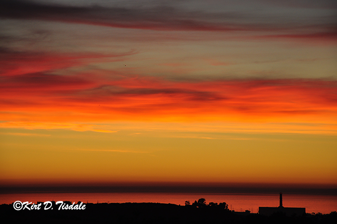
The first one is a trail that takes you from the valley floor outside of North Bend in the mountains just west of the Seattle metropolitan area to a panoramic ledge overlooking that same valley called Rattlesnake Ledge.

From start to finish this particular hike is the most dramatic of the ones I’m sharing today, so I have included a capture I took looking out at Rattlesnake Ledge. Note the lower right hand where you see people on this trail coming out to the ledge.

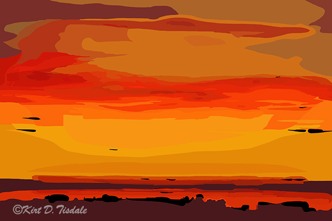
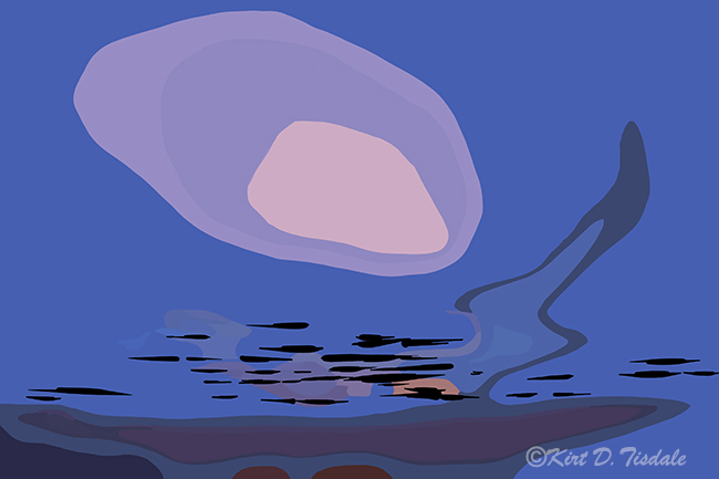
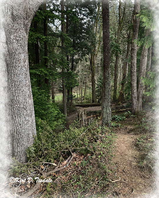
From there I take you onto Cougar Mountain which is located in the Issaquah, Washington area. Issaquah is an eastern suburb of Seattle at the foot of the Cascade Mountain Range. Below are two art prints depicting different aspects of that hike.


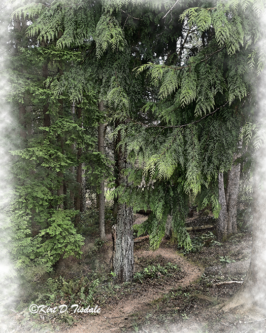
And then from there I take you up to the northern part of the Seattle metropolitan area in Everett. This trail is located in a park along Possession Sound, so this particular forest is right along the water which you lose sight of once you start the hike.
Thoughts? As I have said before, everyone reacts to visual art techniques and looks differently, so I am not in the least offended by opinions.
Follow my work:
My art gallery: TheWallGallery
Facebook: TheWallGallery.KirtTisdale
Instagram: instagram.com/kirttisdale/
Twitter: KirtWallGallery