It seems to me that whenever I come across photo opportunities that are of the old west, my mind immediately thinks “What would this look like in a sepia tone?” The sepia tone gives photography an old rustic look since it dates back to the 1880’s and is a familiar sight from photography taken in the old west. Living in the Phoenix area, there are plenty of opportunities to capture shots from that time period. A couple of weeks ago, we had family visiting and decided we wanted to go up to Tortilla Flats for lunch. None of us had been out there in a number of years and thought it would be fun. For those of you that are wondering what Tortilla Flats is, it is a replica of an old west town (and I use the term loosely) that houses a restaurant, saloon, ice cream parlor, gift shop and small museum. Tourist attraction, you say…absolutely but based on actual history. It was a stagecoach stop and originated as a camping ground for prospectors searching for gold in the surrounding Superstition Mountains. Needless to say, there are numerous “Old West” photo opportunities. I wanted to share a couple of shots that I took that day and walk you through my “sepia” process to create that old rustic look to the photos.
Both shots actually look good in color, but for someone who wants an art print of the rustic old west, they typically are looking for the sepia tone as they decorate a room around that warm earth tone.

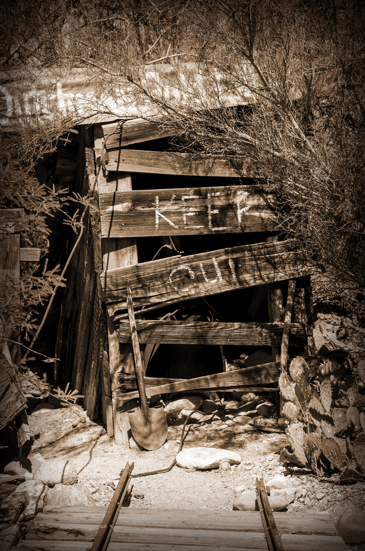
Old West Mine 1
The first shot is of a fake gold mine; the “Lost Dutchman Gold Mine” which is rumored to be loaded with a cache of gold somewhere in the Superstition Mountains. This setting is part of the “ambience” of Tortilla Flats and created a great photo opportunity.
In this second shot, I converted the photograph to a sepia tone using Photoshop. The look now takes on an age by using this color.
The last shot shows the sepia tone, but with a light filter darkening the edges, creating a focal point, depth, and drama completing the look I am going for.

Old West Window 1
This next shot is of an old wooden window partially boarded up (again… ambience for the setting) and a great photograph. I like the color in this shot as it pulls the wood grains out, but for purposes of an art print portraying the look of this era, I convert to sepia, which is the next shot.
And then doing the same lighting treatment as in the first series, I finish up with an art print that has a touch more drama to complete the look I was going for.
Thoughts?
Please visit my main gallery: TheWallGallery (All domestic orders over $60.00 – free shipping!)
Follow my work:
Facebook: TheWallGallery by Kirt Tisdale. (Page likes are always appreciated!)
Google+: TheWallGallery
Twitter: KirtWallGallery
Instagram: Kirttisdale
Tsu: KirtWallGallery