I have attached three art prints with the message “He Walks With You Always”. Two of them are photographic captures and the other one is an abstract print I created. I think it’s important to remind ourselves that we are not on this journey of life by ourselves.
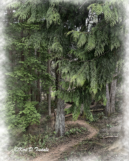
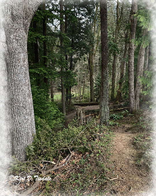
With spring in full bloom here in the Pacific Northwest, it hasn’t taken me long to get back out hiking in the forests. I have attached five new art prints I created of local hiking trails. I used a watercolor technique depicting five different aspects of three of the local hiking trails.
The first one is a trail that takes you from the valley floor outside of North Bend in the mountains just west of the Seattle metropolitan area to a panoramic ledge overlooking that same valley called Rattlesnake Ledge.
From start to finish this particular hike is the most dramatic of the ones I’m sharing today, so I have included a capture I took looking out at Rattlesnake Ledge. Note the lower right hand where you see people on this trail coming out to the ledge.
From there I take you onto Cougar Mountain which is located in the Issaquah, Washington area. Issaquah is an eastern suburb of Seattle at the foot of the Cascade Mountain Range. Below are two art prints depicting different aspects of that hike.
And then from there I take you up to the northern part of the Seattle metropolitan area in Everett. This trail is located in a park along Possession Sound, so this particular forest is right along the water which you lose sight of once you start the hike.
This week I’m going to start with one of the finished art prints and the capture that inspired it. Next, using the same subject matter, but slightly different framing of it and the resulting three different prints and the original capture that inspired them.
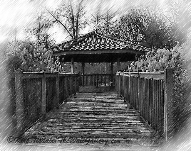
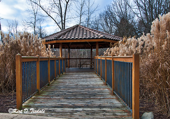
The first one is titled The Pavilion By The River Sketched. The setting in all of the following examples is a natural reserve along the Rogue River in Rockford, Michigan.
Next is the photographic capture that inspired the sketched print in color.
Rogue River Pavilion 1
For the sketched version, I liked the idea of including the lamppost in the final sketch.
The next three art prints were inspired by another photo of the same subject. I like the way it centered the entrance bridge. In the first one, I used a gothic painting technique which focused on the earth tones of the setting and the general appearance of the structure. This creates an overall look without all of the details of the setting.
When I see a lot of detail in one of my captures, I always explore what it looks like as a black and white photograph. I liked the way this approach highlights all of the detail of the pavilion and the natural surroundings (the photographs were taken during the winter months – thus the detail of the leafless tree branches).
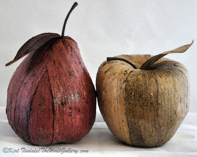
For todays post, I wanted to share the process I went through in creating some “fruit” still life art prints. The art prints started with photographic captures I took of decorative fruit. The fruit pieces in question were decorative elements we had on our dining room table.
I took a picture of a decorative pear and apple side by side –
Pear and Apple Blog
From there I created an art print using a basic watercolor technique –
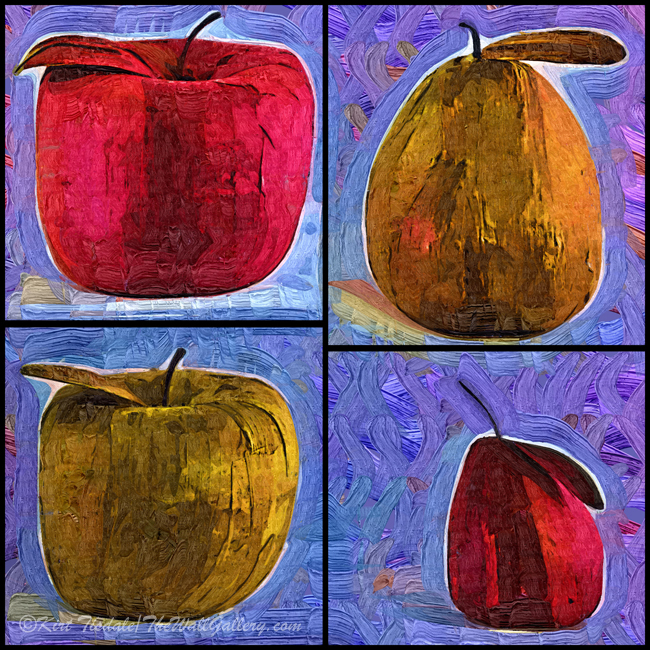
The next series of photographs I took were individual captures of two pears of different colors and two apples of different colors. I then cropped the four different fruits into a square with the brown and red fruits diagonally across from each other.
Pear Apple Squared Blog
I then created an art print using the same abstract watercolor technique.
This week I’m featuring two black and white sketches I created. Each sketch is of an “up-close segment” of the Seattle Great Wheel. The Seattle Great Wheel is a ferris wheel standing 175 tall with 40 gondolas each seating up to 8 individuals and was built in 2012. It’s located at the end of pier 57 in the downtown harbor area overlooking Elliot Bay. The visual aspect of it drew my attention and I took a number of pictures looking for some type of artist inspiration. After studying the pictures the thing that drew my attention was the “delicate” look of it compared to the high-rises in the downtown core. The vision I had was sections of the ferris wheel from unique perspectives done in black and white sketches. Attached are the inspirational captures and the resulting sketches.
The first picture is of the Seattle Great Wheel at the end of pier 57 with some of the downtown high-rises along Elliot Bay.
Seattle Great Wheel on Pier 57
I also took a number of shots on the pier under the great wheel itself. Those captures are what led to the ultimate art prints I created.
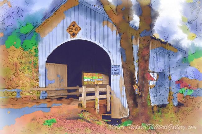
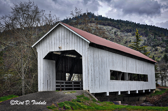
I did a photoshoot of covered bridges in Oregon a few years back. I wanted to share the original captures of two of the bridges I shot. I then turned them both into two versions of watercolor prints. The first version is a soft watercolor technique (a more traditional look) and the second version is an abstract watercolor technique (a more contemporary look).
The original capture of Neal Lane Covered Bridge –
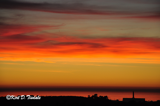
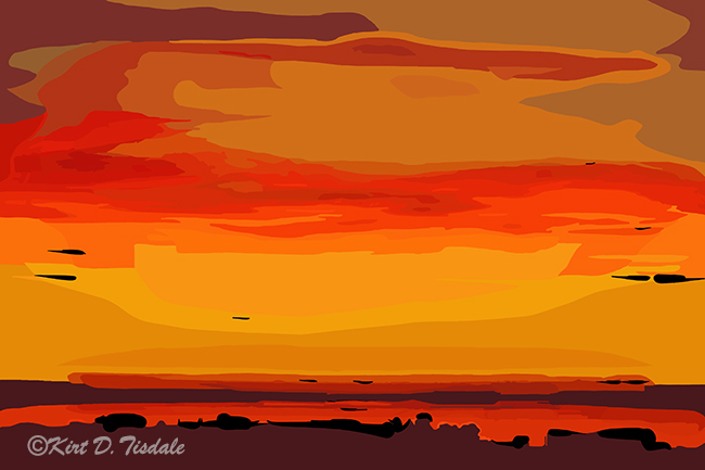
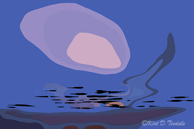
I’ve been sharing this year some of the photographs that have been the inspiration or original version of my art prints. This week I’m sharing my abstract art interpretation of two coastal sunsets and one coastal moon set. All three are along the Pacific Ocean coastline…one in San Diego County and two in Northern California.
The first one is based on an actual photograph of a sunset I captured from the bedroom deck of our house. Our neighborhood was built on a ridge of hills that was located next to the Carlsbad Water District retention pond (Carlsbad is a coastal community in Northern San Diego County). I mention that because the bulk of the land to support that retention pond was a wide open field that will never be developed. It afforded all of the homes along the western front of the neighborhood great ocean views. The house we raised our girls in was at the end of a cul-de-sac that was on that western edge of the development affording us a view of the coastline and the Pacific Ocean.
Carlsbad, California Ocean Sunset
Using this photograph I did a digital re-creation of the scene for my Abstract Art Gallery.
The next two art prints were created from memory, again using abstract art as the focus of the creation. The two depictions came from memory of coastal scenes in Northern California that really stuck with me. The first one is a sunset with a typical evening marine layer of clouds coming in just before the sun actually set. The low clouds would part sporadically and allow the setting sun to shine through.
The next one was a full moon setting as a marine layer started rolling in. The low clouds would part sporadically and allow the setting moon to shine through very similar to the setting sun creation above.
In these series of prints, I used photographic captures from a flamingo exhibit at the LA Zoo as an inspiration for the poses. I then drew each flamingo pose in Adobe Photoshop and filled the drawings with an abstract watercolor look. I then took the series of flamingos that I had created as individual art prints and added inspirational words for each one.
Over the last few weeks I have been sharing how I work with and create different art looks from an original photographic capture of mine. This week I’m sharing the different prints I felt worked well with one particular bible quote from John 13:34. The verse is very simple and speaks volumes to how we should interact with each other. Each particular print spoke to me as a background to this verse. There’s seven total and I usually don’t do that many with the same verse, but this time I felt the need to.
The setting is Papago Park in Phoenix, Arizona. Papago Park is located next to the zoo and the botanical gardens. In the middle of the park are two large ponds. The stillness of the water allows for the row of palm trees to be reflected in the water creating an added dimension to the scene.
Starting with the original capture of the palm trees reflected on the water….
Papago Park Original Capture
I did a color correction to emphasize the blue sky and the deep blue of the pond.
Papago Park Color Correction
From this capture, I started playing with digitally painting it using a variety of styles. I started with a simple sketching technique. This technique created a softened, peaceful look to the setting.
From there I used an impasto technique which creates bold brush strokes and a strong focal point with lighter shades of color. I also reframed the capture slightly to narrow in on the central cluster of trees.